In my view, the most exciting aspect of using R is the vast ability to customize graphs. As a beginner, graphical presentation in R is challenging and not easily memorable. Therefore, I developed an easy to follow strategy that helps in navigating graphical presentation in R.
In this session the following R packages are discussed:
- Tidyverse (which includes ggplot2)
- Ggthemes
Introduction
Graphical presentations can be done using base R code (without additional packages), or with specific packages. The most common package is ggplot2, which is also included in the tidyverse collection.
There are three mandatory parts of code for ggplot2 graphs:
- Ggplot() – commands the program to make a plot using ggplot package.
- Aes() – placed inside ggplot() command, provides “aesthetic mapping” of geoms
- Code specifying type of plot “layers”. For example geom_point(), which creates a scatterplot.
- Note: several layers can be added to each plot
The ggplot2 cheat sheet provides a great way to get started with ggplot2. It introduces the basic understanding and most functions. Otherwise, the github site for ggplot2 also provides information and links to free material (a comprehensive book, a webinar and more) for further learning.
Get started
After exploring your data, you probably have an idea about the type of graphical presentation you would like to make. To find the appropriate code, the easiest way is to visit data-to-viz.com. Just by scrolling down you can explore appropriate figures for your data.
Clicking on an option opens a window where you can read about the selected graphical presentation. In this new window, click on R graph gallery. Here you are presented with several options, clicking on any of them shows the code needed for your graph.
You can now copy the code to your R session, re-write the name of your dataset and variables and run the code.
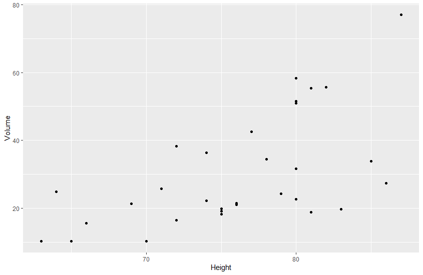
The following example utilizes data from the dataset “trees”, which is available in R. This dataset contains three numeric variables: Girth – diameter in inches, Height – in ft, and Volume in cubic ft.
Text following “#” is translation/explanation of the code.


Customization
We now have a simple plot. To customize it we can add code to change the theme, labels, legends and much more.
Here, I will discuss changing themes, labels, and legends briefly.
Themes
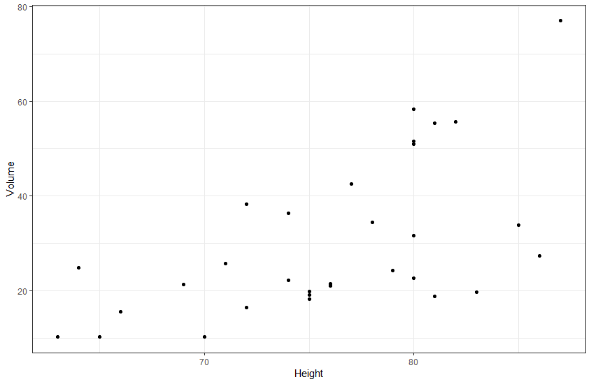
Themes help change non-data display. There are multiple themes in the ggplot2 package, and the package ggthemes also provides more options.
Theme commands begin with “theme_…”.

Labels and legends
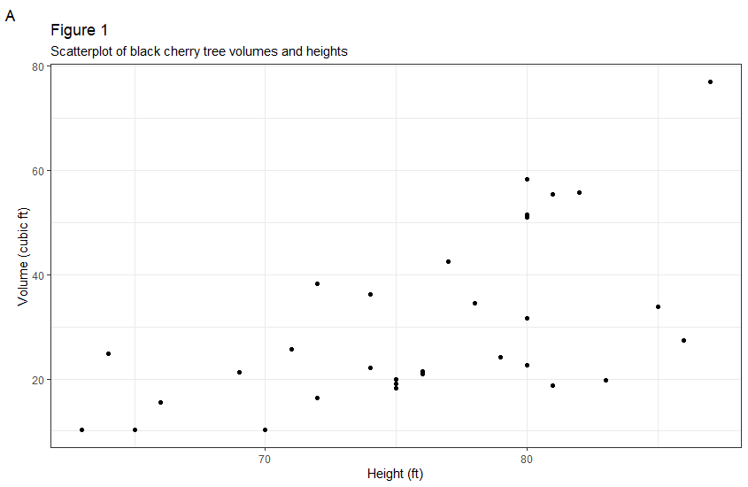
Labels and legends can be added or changed with the command “labs()”. With this command we have the option to change/add a plot title, subtitle or tag.
To change the X- or Y-axis labels, we can use the commands “xlab()” and ylab() respectively.

